.ids
Intuition Design System, IDS — a design system for building landing pages, online publications, and any digital web products that are based on narratives.
Technically, IDS is a set of CSS classes and JS components. It’s not a library, but a ready-made layout template. You don’t include IDS in your project as a dependency, you don’t extend classes, you don’t override properties. Instead, you simply copy its source code and modify it however you like. No compatibility issues and no breaking updates.
IDS is distributed under the MIT license — you can use and modify it for free, no restrictions. We also don’t accept complaints, can’t provide guidance, and there’s no support service. If you’re interested but not sure how to work with it — welcome to the course “How to Design with Code”, it will help.
Setup
Basic design system parameters are set in the settings.css file.
Font
IDS uses the Inter font by default, the variable web version. It’s great!
But the design system isn’t tied to a specific font — you can use any font. Just place the font files in the fonts folder and edit the
Fonts section in the settings.css file. Please try not to pirate fonts.
Density
Different fonts suit different layout densities. Additionally, density is an aesthetic choice — sometimes you need tight layout, sometimes airy.
IDS has a variable --ids__density that affects text line-height, as well as margins and paddings of all text elements. To adjust layout
density, first try to find the optimal value for this variable, then edit individual styles.
Responsiveness
IDS assumes there are only two types of devices: mobile and desktop. This is determined by viewport width (simplified: browser window width): less than 768 px means mobile, more means desktop.
IDS implements the Fluid Typography concept — where the font-size for body is calculated based on viewport width, and then em or
rem units are used not only for text but also for margins, paddings, border radii, and sometimes element dimensions.
This approach simplifies design debugging. First, you need to find the optimal font-size range suitable for the chosen font and desired size of “regular” text.
This range is set by the variables --desktop-font-size-min and --desktop-font-size-max. You need to find values such that when the
width changes, the text scales while preserving line breaks. Then you can check the layout at just one width, knowing that at any width the element
arrangement will be preserved.
For mobile, you need to find your own pair of values --mobile-font-size-min and --mobile-font-size-max, but the idea is exactly the same — consistent layout on
phones of different widths.
Color
IDS stores the color palette in variables. Color naming is functional: named after what it’s used for.
text
link
hover
mark
code
accent
surface
background
The color palette lives in the colors.css file.
Each variable stores a string of three comma-separated values in RGB space, for example: 253, 47, 75.
Not like this
color: var(--ids__accent-RGB);
But like this
color: rgb(var(--ids__accent-RGB));
color: rgba(var(--ids__accent-RGB), 0.5);
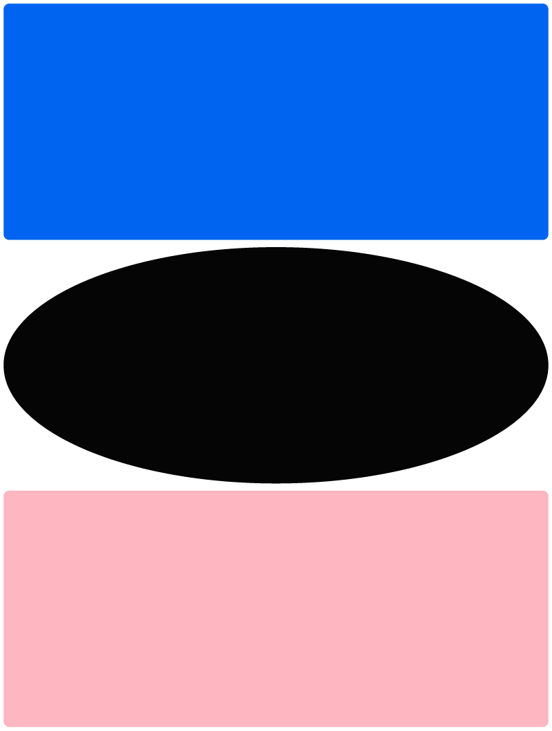
Page frame
IDS doesn’t use modular grids or columns for page space organization. It’s simpler: the page consists of “floors” that go from top to bottom one after another, each takes up the full available width and can be any height. This approach doesn’t prevent creating modular grids and complex compositions inside a floor, but the isolation of floors allows easily rearranging them and eliminates any interdependency.
Wrappers
.ids__wrapper — standard floor with large margins on desktop and minimal on mobile.
.ids__wrapper.L — floor with increased width. Different only on desktop, on mobile it matches the standard.
.ids__wrapper.XL — full-width floor with minimal margins. Different only on desktop, on mobile it matches the standard.
.ids__wrapper.XXL — full-width floor without margins, on mobile too.
For single-column text inside a standard floor, an additional wrapper is used that reduces the width and leaves extra margin on the right. This is only on desktop; on mobile, full width remains.
.ids__text-width
Vertical spacing system
In IDS, wrappers have zero margins, and most other elements have only a minimal bottom margin, to lay out elements in a continuous flow.
When noticeable spacing is needed — for example, between floors or before a heading so it doesn’t stick to the previous paragraph — special spacers are used.
ids__space.S
ids__space.M
ids__space.L
ids__space.XL
Tag styling
IDS styles some commonly used tags so you can lay out large volumes of text while keeping minimal markup. Tag styles are defined only
inside the .ids container.
Here are the tags styled inside .ids.
Headings
h1
Main page heading
h2
Second level heading
h3
Third level heading
h4
Fourth level heading
h5
Fifth level heading
h6
Sixth level heading
Sometimes you don’t visually need headings as large as h1 or h2. But according to accessibility standards, the page must have an h1, and the next level must be h2, and so on, without gaps. To resolve this contradiction, we’ve prepared special classes that reduce h1 and h2:
h1.S
Main heading, reduced
h1.XS
Main heading, reduced even more
h2.XS
Second level heading, reduced
Sometimes you want to attach a label, tag, or badge above a heading. For this, the hgroup tag is used.
hgroup
p
h1
Heading label
Main page heading
Text
p
There’s never enough information for making decisions, by definition. When there’s enough information, the right move can be “calculated,” determined with high accuracy based on data, adding two and two. If there’s enough information — there’s nothing to decide.
p.loud
A designer should be independent, versatile, multidisciplinary, and complex.
p.huge
I changed my mind.
mark
code
Used to highlight an important thought or a code fragment.
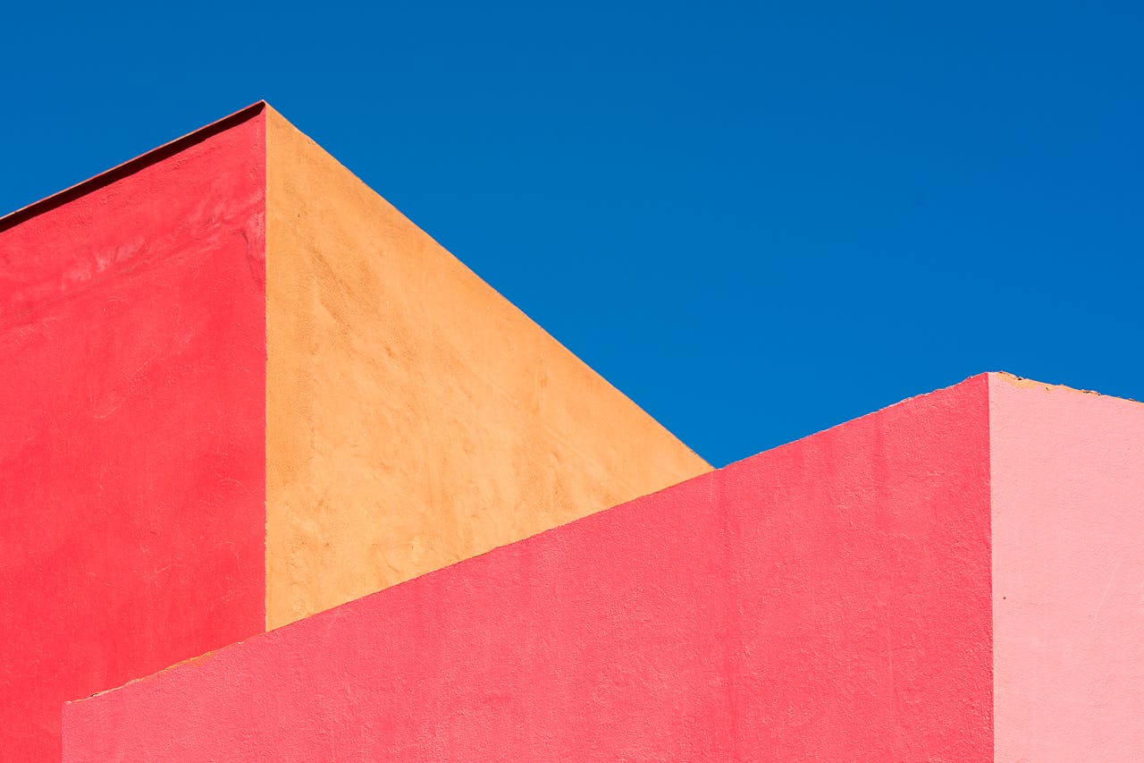
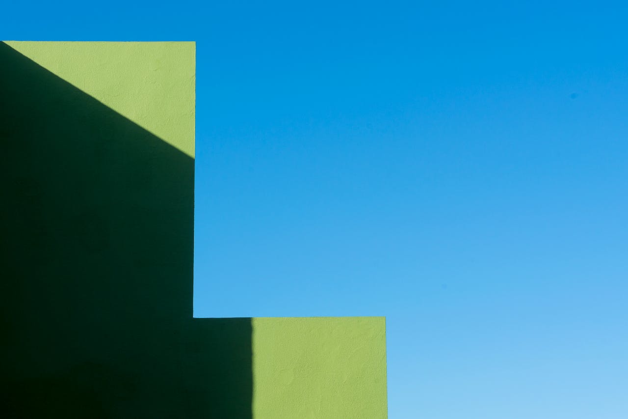
Illustration
figure figcaption

List
ul li
- No,
- no
- and no.
ol li
- Basic level
- Functional level
- Empathic level
Additional text
aside
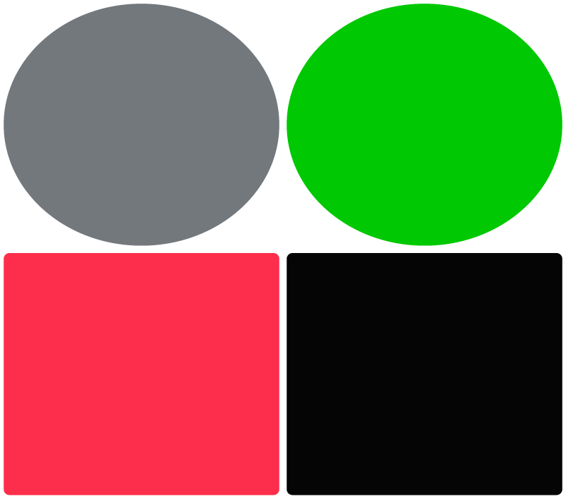
Grid
Using the .ids__sequence class, you can quickly create a grid of identical elements, implemented via display: flex. Make
.ids__sequence the parent, and wrap each grid cell in .ids__sequence-item:
.ids__sequence
.ids__sequence-item
.ids__sequence-item
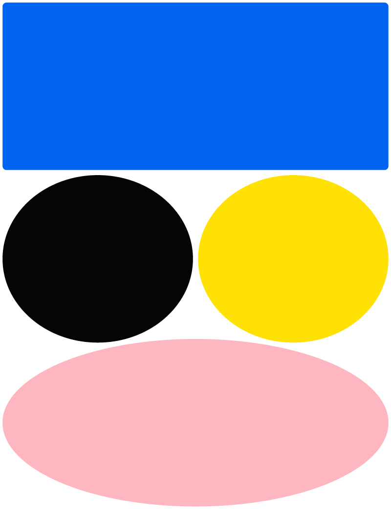
Size modifier
ids__sequence.XL
Text in cell
Text in cell
ids__sequence.L
ids__sequence.S
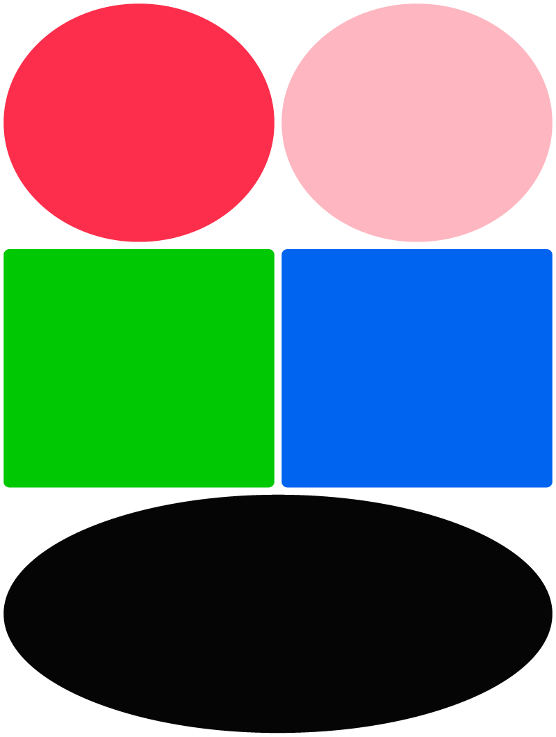
Gap control
.ids__sequence.XL.gap-L
.ids__sequence.XL.gap-M
.ids__sequence.XL.gap-S
Table
table — regular table
tr, th, td — standard table elements. Well, except th sticks to the top of the window.
Components
.ids__sleepy
Component for animating element appearance on scroll.
Tracks element visibility and removes the
.is-sleeping class when more than 30% of the element
is visible on screen.
The component automatically initializes for all elements with
the .ids__sleepy class on page load. It
only adds and removes the modifier class, nothing more.
Accordingly, for the animation to work, you need to
-
add the
.ids__sleepyclass to all elements that should animate when appearing on screen; -
add the
.is-sleepingmodifier class definition to these elements with styles for the inactive state; - define the transition property to animate the changing properties.
ids-footnote
ids-footnote-link and ids-footnote —
components for creating popup footnotes with automatic
numbering.
The system consists of two parts: the trigger link
(ids-footnote-link) and the container with footnote content
(ids-footnote).
Usage example:
This is simple text with a
This is the content of the first footnote. It can include any markup: paragraphs, links, lists.
And this is the second footnote. Note that the number appears automatically.
A footnote can contain multiple paragraphs. If the content is too long and doesn’t fit on the screen, a “Close” button appears, and main page scrolling is blocked.
Markup structure:
<p>
Text with
<ids-footnote-link>footnote link</ids-footnote-link>
in the text.
</p>
<ids-footnote>
<p>Footnote content.</p>
</ids-footnote>
ids-navbar
The component forms a group of links for scroll navigation from elements wrapped in the ids-nav-item tag. Required attributes:
id— unique heading identifierlabel— link text
ids-gallery
Image gallery that opens and navigates in a modal window.
The src attribute of the img tag specifies a reduced thumbnail, and the href attribute of the a tag — the link to full size. (They can match if you don’t want to bother with thumbnails). If the full-size image is different, you need to specify its dimensions in the
data-pswp-width and data-pswp-height attributes.
The content of figcaption is displayed under the preview in the grid and in the modal window when viewing.

.ids__inline-gallery
Gallery that switches with horizontal cursor movement (and swipe gesture on mobile). Built from a sequence of static images and used when you need controlled animation. Or whatever else you can think of.
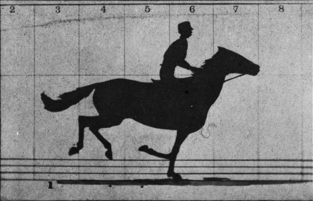
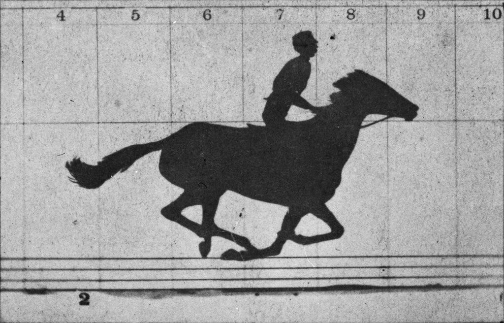
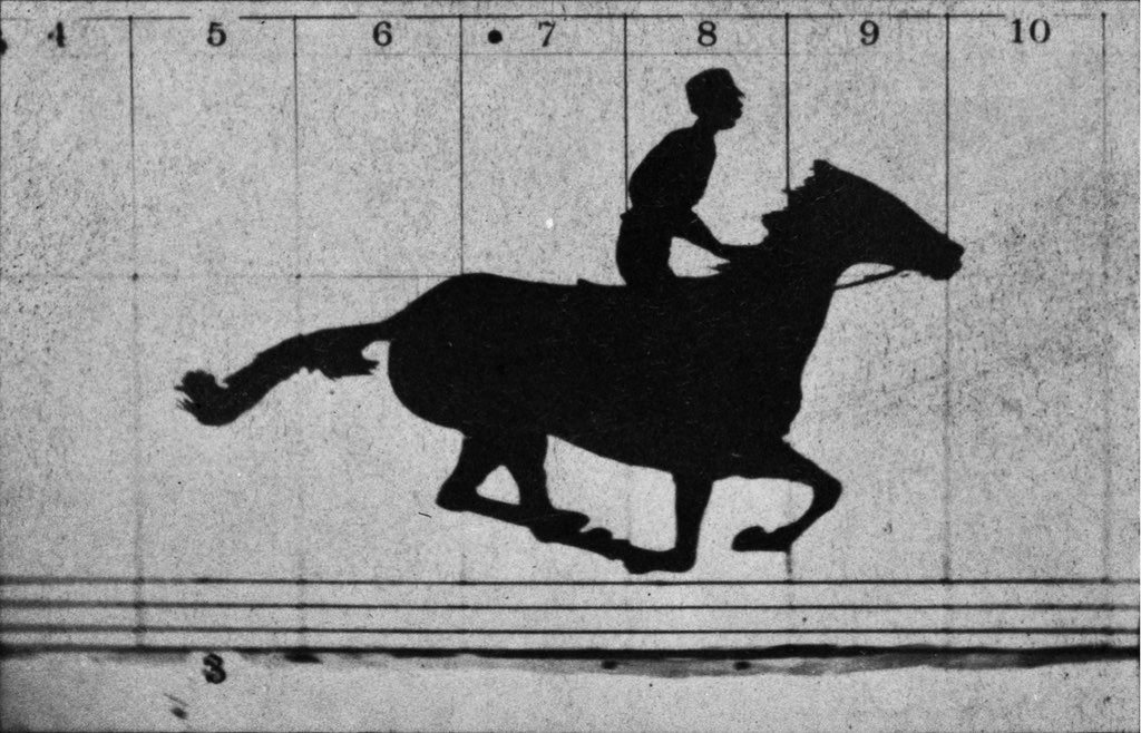
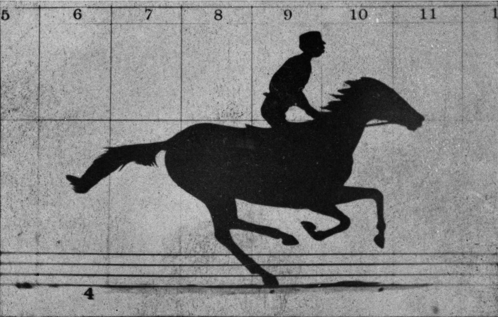
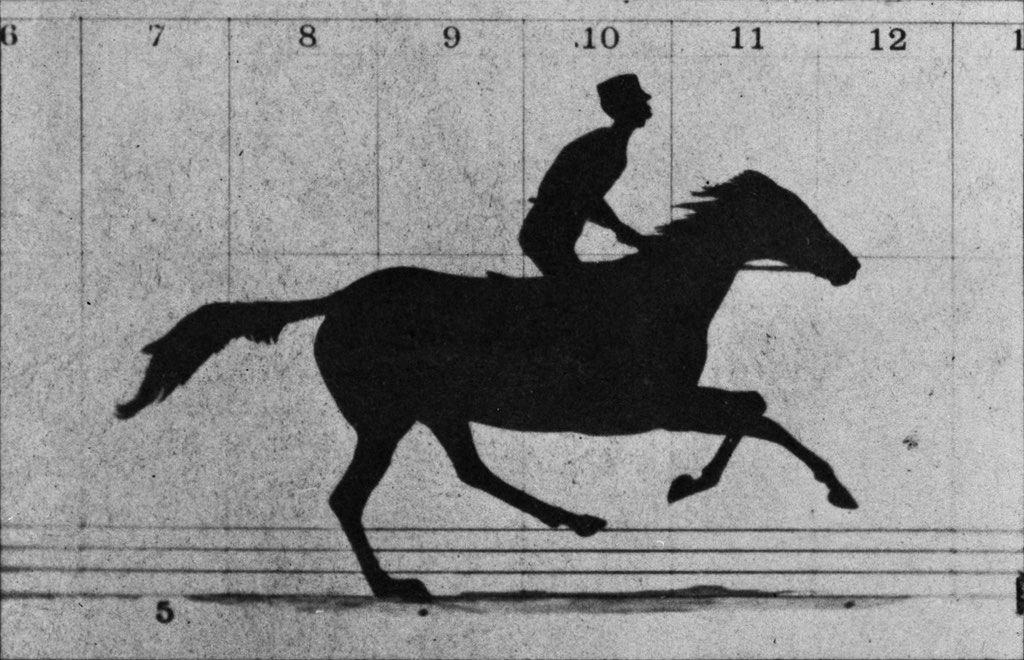
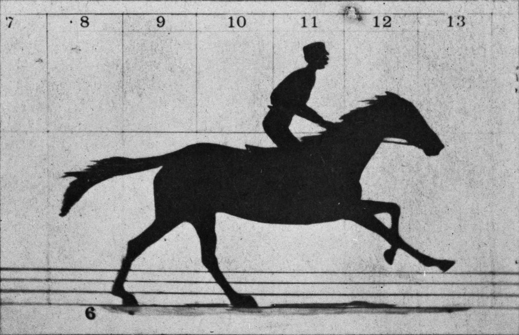
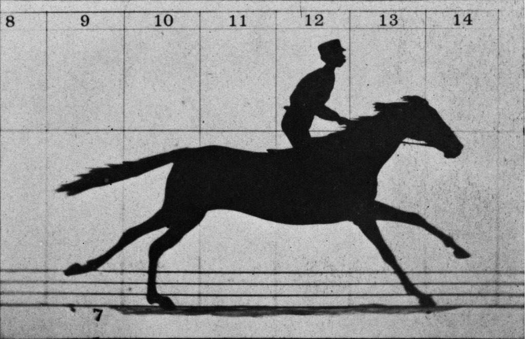
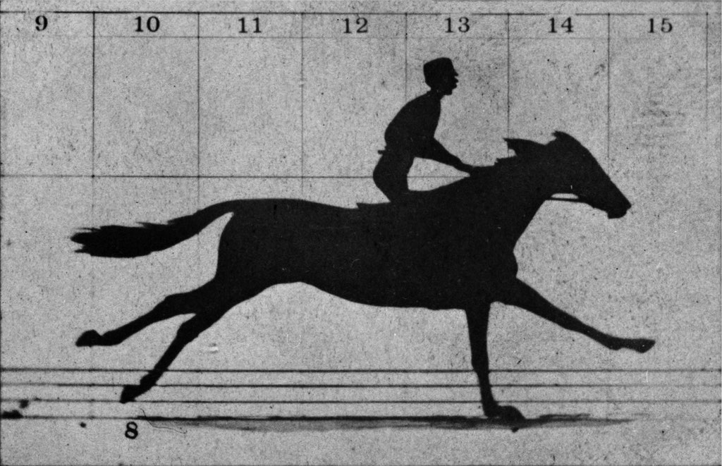
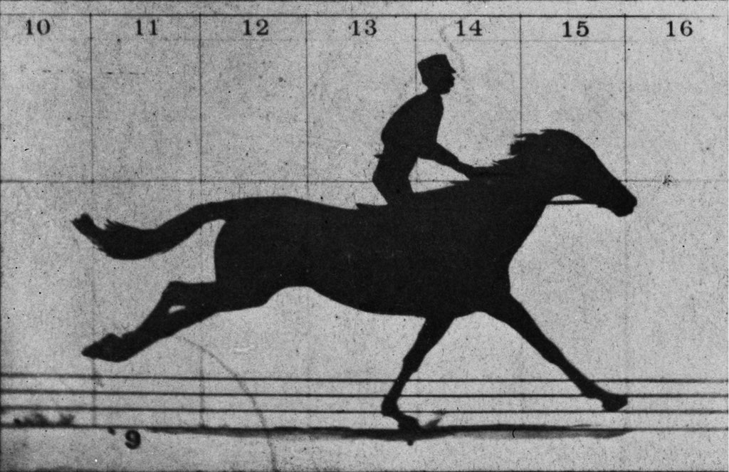
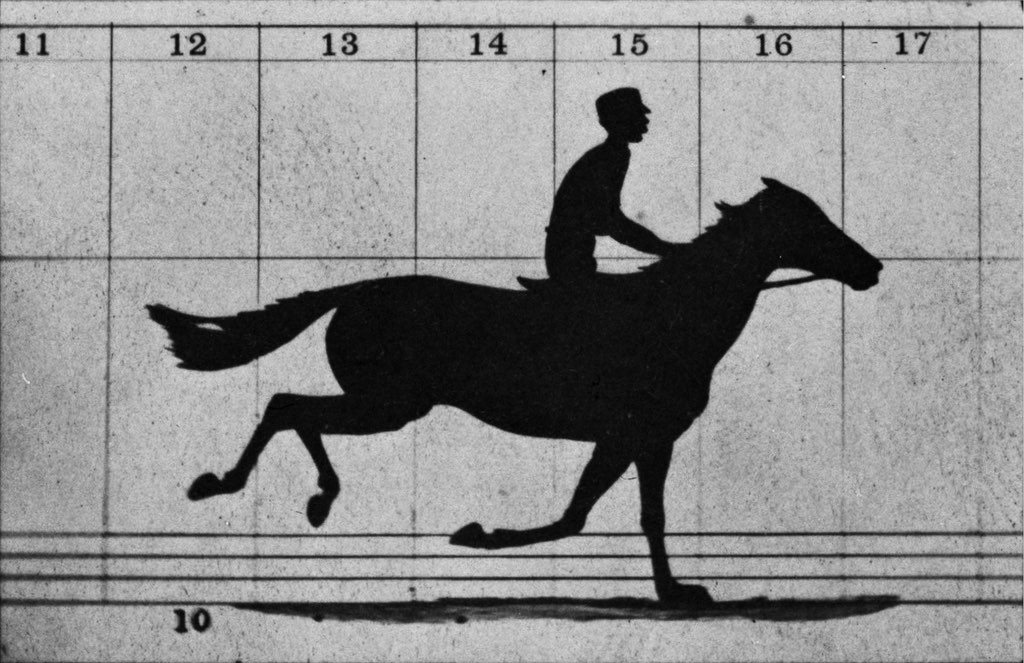
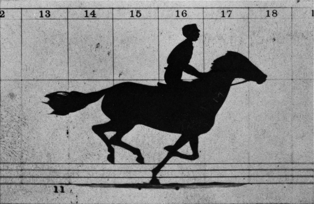
The element takes the width of the parent container. Proportions are set explicitly via the --img-aspect-ratio variable in width / height format. These are the image proportions, not the entire element — it’s easiest to write the file dimensions in pixels there.
If image proportions differ from those set in the variable, images scale to fill the container (object-fit: cover) and are centered.
You can add a link, and then the entire element becomes clickable, and images on hover will have increased brightness.
There are current position indicators — numeric and two graphical variants.
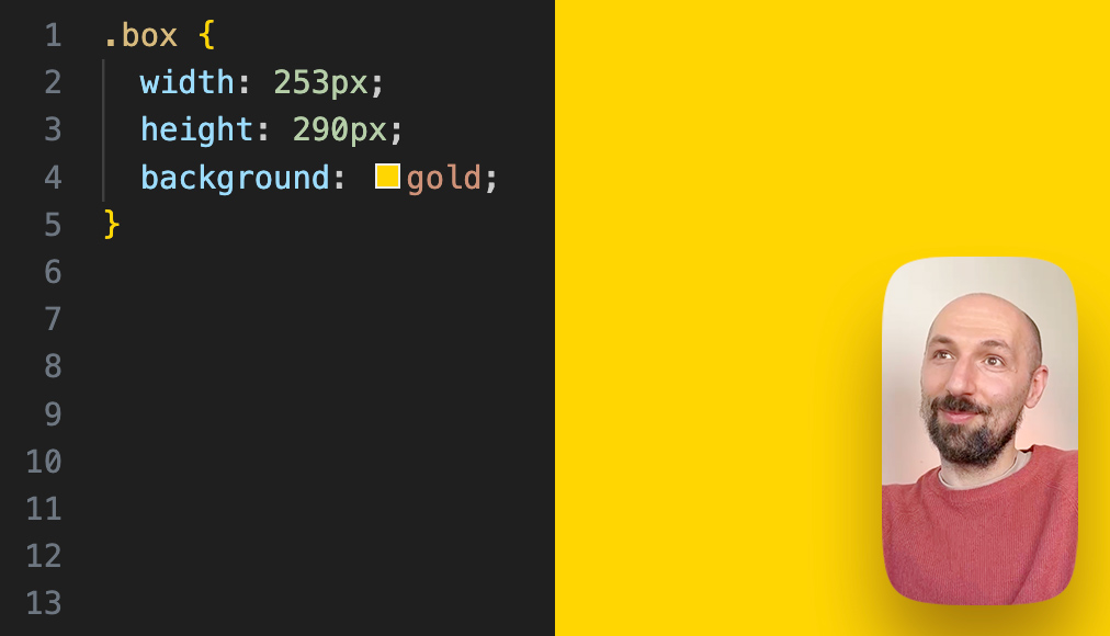
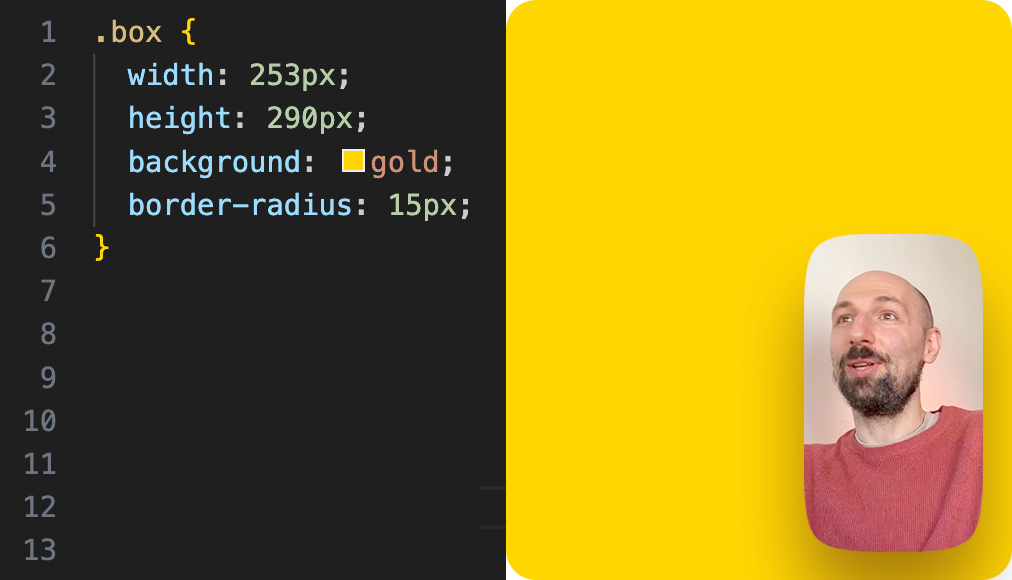
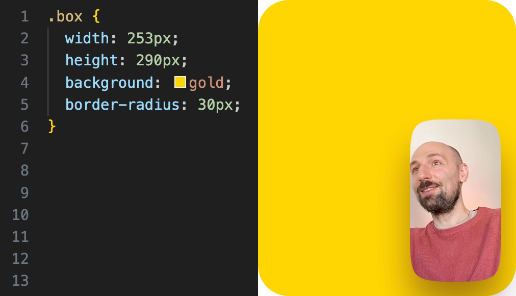
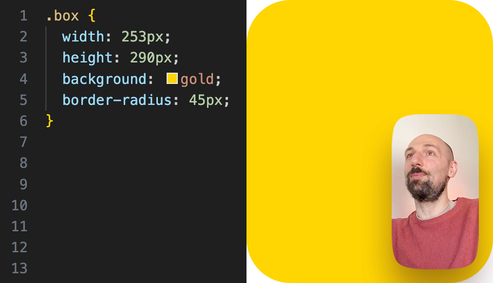
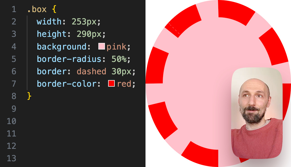
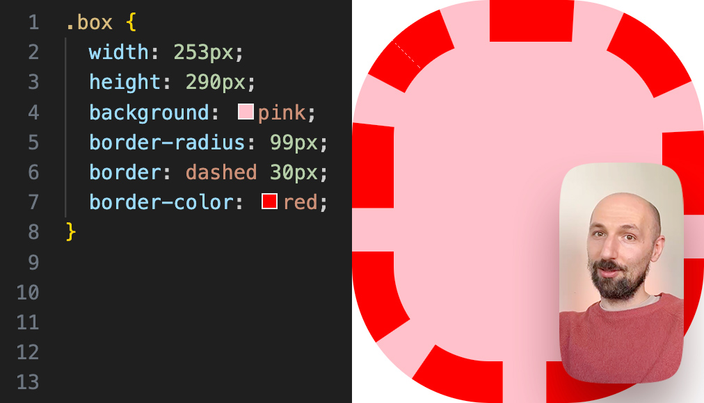
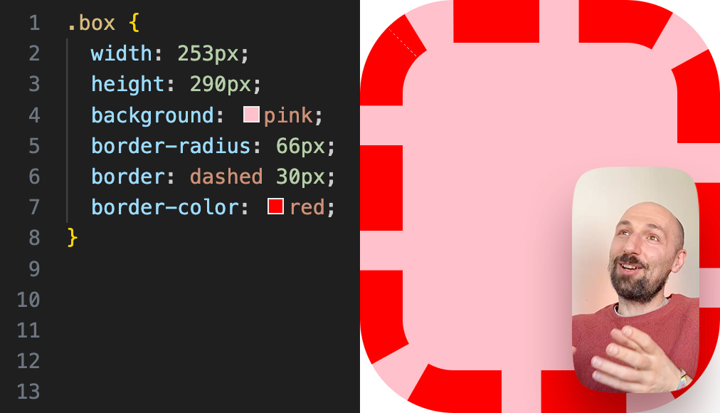
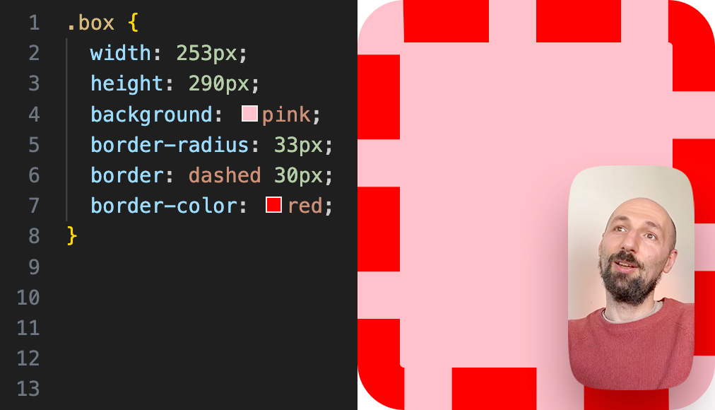


.ids__rounded
Modifier for rounding corners not with a circle segment, but with a superellipse.
The rounding radius is set in the --ids__radius variable, which means it can be set both globally, for the entire document, and locally, for a specific section or element.